Semantic Structure and using Styles
In this article:
Say what you mean. #
It’s so simple in books, right? If it’s an important idea, bold it. Or maybe italicize it. If it’s a section header, make it big.
Chapter title, make it really big.
That’s all there is to it, right?
Right?
Not quite. Not anymore. Life is digital. Books arrive on the page only after journeying through several computers running different softwares.
And even after that, books diverge as they approach the reader, going to hardcover, paperback, e-readers, screen readers for the visually impaired—and who can say what other medium? Books no longer die. They can be expected to live long lives and in many forms. Who knows on what devices or in what formats books will be read in years to come?
Here’s the thing: All those manually bolded, italicized, and embiggened words? They won’t necessarily survive through the transmogrification from one existence to the next. Those simple visually-defined clues can very well lose their intended meanings in the process.
No longer can books rely on visuals to convey what different parts mean.
Now books must embody, in their very structure, how they mean it.

Talking about semantic structure #
Consider the definition of “semantics” offered by W3 Schools:
Semantics is the study of the meanings of words and phrases in a language.
Semantic elements = elements with a meaning.
When we read a print book, we pick up on the meaning from how the text has been styled visually—boldface, italics, enlarged text, all caps, small caps, etc. There’s only one problem with this:
Visual appearance alone does not define semantic meaning. #
Web design taught us that simple text sizing and bolding wasn’t enough. For search engines and screen readers to understand what was on the page and how each element related to the others, we needed semantic markup—and it had to extend beyond mere <div> blocks containing <p> tags and header tags like <h1>, <h2>, etc.
Over several iterations, leaders in web and accessibility standards in collaboration with browser developers established markup elements—invisible to the reader—that define the semantic meaning of the text on the page. At the most basic level, we’re talking about what is a paragraph, what is a header, what text is emphasized by the author, and so on. Moving out from there, this semantic markup describes what is an article, what is an aside, what is a section of a larger piece, etc. Layers on top of this semantic architecture define additional identification metadata—microformats, RDFa, ARIA roles, Schema.org markup, Dublin Core—for the purposes of accurate indexing and providing accessibility for people with disabilities.
On the printed page… #
We see and identify the basic semantic structure through the visual cues in the typography and layout. Emphasized text becomes italicized or bolded. Headers are enlarged, styled, and set on their own lines. Chapter titles start on new pages.
On the digital screen… #
The appearance of these visual cues reflects what is actually defined in semantic markup (and styled in CSS stylesheets). We as readers don’t see that underlying architecture; we just interpret the architecture from what we see.
As readers… #
We identify this paragraph here as a new paragraph because we see the break before it. But semantically, this is a new paragraph because it has been tagged with a <p> tag that identifies this as paragraph element. The break we see is a result of formatting styling applied to the semantic tag. In other words…
Because this is a new paragraph, the web browser (or reading device) presents the text as a new block of text—in this case, with a break before it.
Yet it doesn’t matter how the paragraphs are styled. For example, the text in this text is marked by regular paragraph tags. For visual readers, the distinction may seem obvious. But there are differences in semantic markup as well. That means readers of this sentence on different devices, or using a screen reading device, may not see the box around this text, but they will know from the semantic indicators that this text has been set apart as an aside.
And yet, even though the paragraphs are styled differently—with book-style indents rather than spacing between paragraphs—the underlying markup is the same: words separated by spaces, demarcated by periods into sentences, and set off into paragraphs.
This is an aside because it is marked semantically as an aside. The semantic markup governs the meaning of the text. Visual readers interpret the meaning through the visual cues provided by the styling of these elements. But screen readers, indexing robots, and visual readers seeing this on other websites or in an RSS reader will also be able to understand the semantic difference of this section.
It’s not just for websites #
Let’s look at the creation of a book. The author writes it and (hopefully) rewrites it. At some point, the author uses computer software. Maybe it’s Microsoft Word. Maybe it’s Scrivener. Or Google Docs. At some point, the author is done and hands off the manuscript to the editor (either directly or after sale of the book to a publisher).
The editor almost always works in Microsoft Word.
So does any other editor touching the manuscript.
For better or worse, Word is unavoidable in books publishing. Yes, there are workarounds—but those workarounds do not avoid the need for defining and retaining the semantic meaning of the manuscript content.
Books are born from a Styled process #
—Not styled as in uniform, but Styled for consistency as it moves through the process from author to reader.
In Microsoft Word, semantic meaning is indicated by application of Styles.
Microsoft describes Styles as:
Built-in styles are combinations of formatting characteristics that you can apply to text to quickly change its appearance.
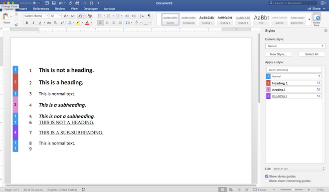
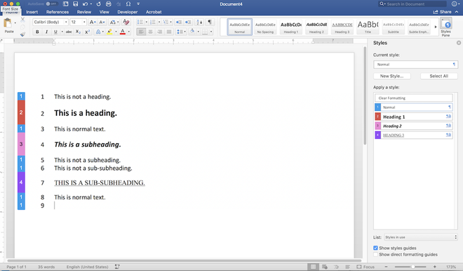
What they don’t say is the most important thing—that Word’s Styles define semantic structure. Styles designate what is a paragraph, what is a header—and what kind of header—what text is emphasized, and so on.

The application of Word’s Styles represents the best method to define the semantic structure of the text—headings, paragraphs, emphasis, etc. Without Styles, the semantic structure of the manuscript is left to visual cues only, and that can lead to problems.

Direct formatting is a terribly fragile way to go in the imperfect process of transitioning the book from application to application, from format to format. Not only can a subheading or chapter title indicated only by visual formatting end up getting missed or misinterpreted by and editor or book designer, such visual indicators can be lost along the way simply by technical glitch in the software—and they are next to useless for screen readers.
- A technical glitch might remove a bolded passage.
- A software hiccup might remove formatting on a heading.
- A migration from one format to another might interpret chapter titles as regular text.
Styles provide the most robust and specific means to define and sustain semantic intent as the manuscript goes through the process of becoming a book.
- For the editor(s) using Word.
- For the book designer using InDesign or other layout program that imports Word Styles into InDesign Styles as part of the creation process of the print master.
- For the ebook designer/formatter who translates Word or InDesign Styles into HTML as part of the process of creating the ePub and/or Kindle master.
- For the meatgrinder, KDP file upload/converter, and other automated conversion systems that apply an automated algorithm to the Styles in the Word document to define the HTML structure of the resulting ebook.
- For the ebook reading device that relies upon clearly marked semantic structure in order to indicate chapters, provide a Table of Contents, mark paragraphs, format italics, and so on.
Style me now or Style me later #
For Authors #
Let’s be real now. If Word’s Styles seem like too much to deal with, don’t fret about it. The author’s first priority is on the content itself. Editors are accustomed to receiving from authors Word manuscripts that have few or no Styles applied. If the author has applied Styles to her text, the editors will be able to do their work more efficiently. But not having Styles is not the end of the world.
For Editors #
As a book designer, I say sure, it would be very helpful for editors mark everything with Styles. But as an editor, I feel the primary focus should be on clarity and consistency and the content of the words. Book designers are accustomed to receiving from editors Word manuscripts that have few or no Styles applied. But if Styles have been cleanly applied to the manuscript, that leaves less remediation work for book designers to have to deal with—and greatly reduces the chance that some semantically meaningful formatting is lost.
For Print Book Designers #
Honestly, Styles are not required. It’s perfectly fine for book designers to format a book word by word, paragraph by paragraph. But oh, that adds so much menial work to the job—not to mention adds to the chances of missing something or introducing an error. If they aren’t using Styles, they certainly are not working efficiently. Styles not only mark semantic meaning, they also provide quick and easy ways to modify formatting throughout the document with just a few clicks. (Do you want to change the chapter title font one chapter at a time, or once with a quick alteration of the relevant Paragraph Style?)
For Ebook Designers and Formatters #
Here is where semantic structure becomes absolutely imperative. Without proper markup, an ebook would be just blobs of text, unreadable, illegible, broken. Yes, the technically capable (if not savvy) ebook designer can make everything a basic paragraph and code inline formatting into every chapter title, every subheading, every blockquote. Or a non-technical formatter can use a wysiwyg app to “design” and “format” the ebook. And it might even look okay to visual readers.
But such a document may not embody the semantic meanings conveyed in semantic markup. Screen readers will likely miss nuances. Search bots and indexing systems would have no indication as to the relative importance of such strings of text. And down the line, when the text is repurposed to some new medium or format we haven’t thought about yet—for example, text projected within someone’s virtual reality glasses—who knows what they would see?
Consistency Matters #
If all goes well in the application of Styles across the board, the results in terms of the semantic structure of the text will be consistent between all formats of the book, including those yet to be invented.
- The print book, which incorporates visual formatting to indicate semantic meaning to the reader.
- The ebook, whose content is marked up with HTML to define how to visually format the text for the reader.
- The screen reader, which reads the structure of the content to indicate to the visually impaired book consumer what each blob of text means in terms of structure.
Convinced yet?
