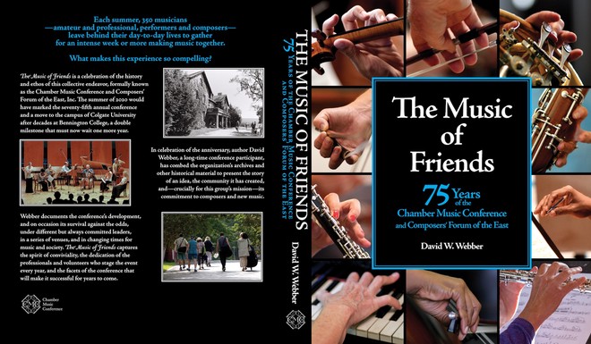
The Music of Friends
A celebration of 75 years #
To celebrate its 75th anniversary, the Chamber Music Conference and Composers’ Forum of the East produced a book documenting its rich history. The Music of Friends was authored by David W. Webber.
I was retained to come up with the overall book design, lay out the paperback print version, adapt the layout and design to an ebook version, and design the covers.
A photographs-rich history #
The primary focus of the book is a written narrative of the 75-year history of the organization and its various events. The Chamber Music Conference’s rich archive of photographs served to supplement and highlight moments of this history.
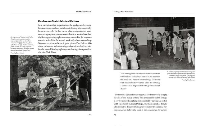
After some discussion, we decided on a 7.5″ × 9.25″ trim size for the paperback design. This allows for a comfortable text column with wide margins generous enough for sidebar content and smaller photographs. Other photographs could be worked into the flow of text.
Chapter spreads #
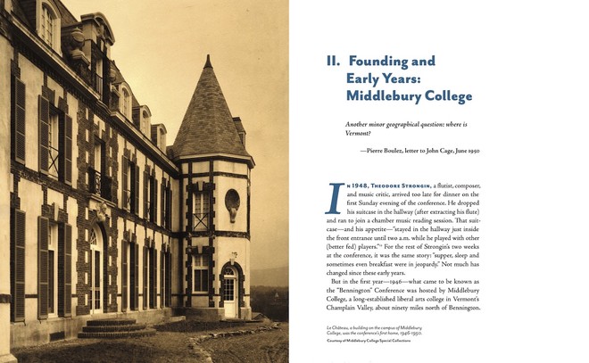
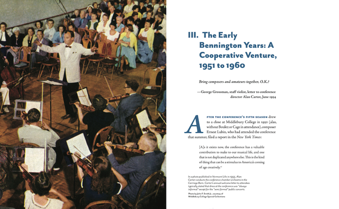
Each chapter begins with a full spread. On the left, a full-bleed single image or a montage of several images. On the right, the numbered chapter title, an epigraph and citation, the beginning of the chapter’s main text, and at the foot, a caption for the image(s) on the left.
Photographs and sidebars #
Working with the client, we chose a dark teal-blue accent color for the chapter titles, dropcaps, etc.
Full-page sidebars and sidebar spreads #
Rich back matter #
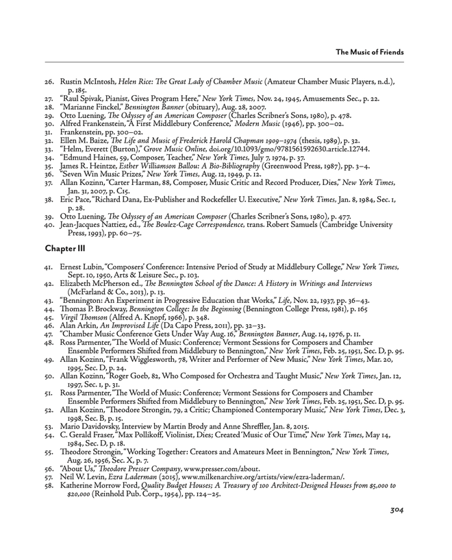
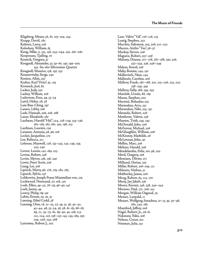
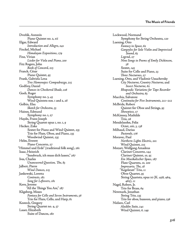
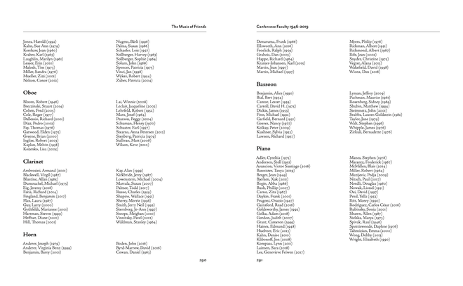
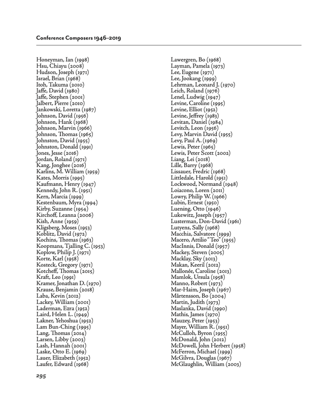
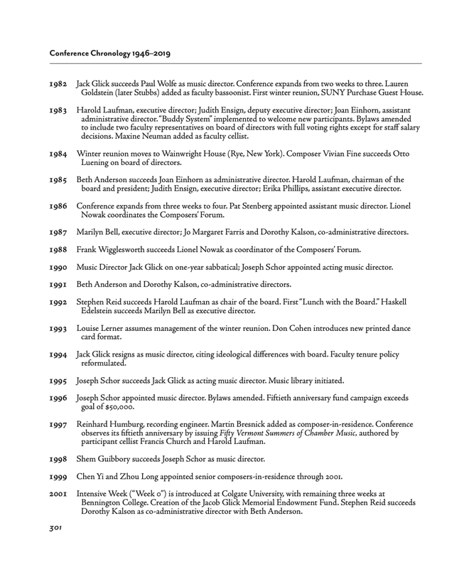
Being a history, the main text was rich with endnotes. (We agreed that endnotes were preferable to footnotes in the interest of keeping the pages “clean” as there already were enough components.) There also was a need for not one but two name indexes, one for people mentioned in the text, the other for composers and their compositions mentioned. The back matter also includes comprehensive lists of participants and composers over the 75 years, and a chronology of notable moments in the history.
Ebook formatting #
Although The Music of Friends contains numerous photographs, the primary flow of the book is as a narrative. Therefore, the ebook is formatted as reflowable text.
The ebook’s visual design follows the overall layout in terms of colors and preliminary font selections (recognizing that readers can override such settings in their own ereader preferences).
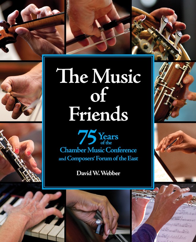
Cover design #
More about the Chamber Music Conference and their 75th anniversary can be found on their website.