From Print to Ebook
During production of Cold Heart: Yamabuki vs. the Shinobi Priest, author Katherine M. Lawrence and I decided to add some additional back matter about the world of 12th-century Heian Japan.
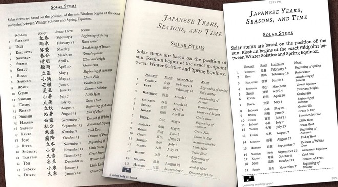
What to do when the content is just too wide to be viewed properly on smaller screens? How do we present this info without sacrificing accessibility?
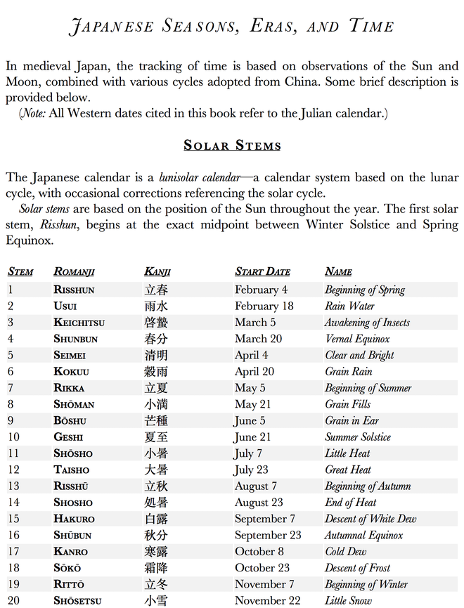
My approach is to adapt the semantic structure of the HTML content from table display to an alternate display — for example, a nested ordered list — while retaining the intended meaning in the content itself. The work is done with some HTML and CSS coding.
The preferred display is very similar to the print layout of the content. The table data is presented in an HTML table and styled with CSS accordingly. Most devices will display the table this way, much as it appears in the book’s print edition.
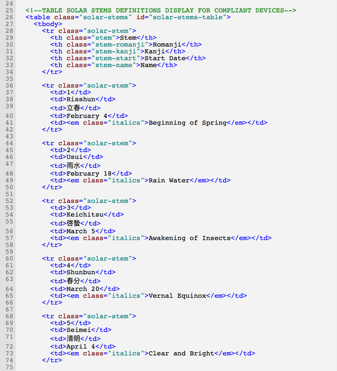
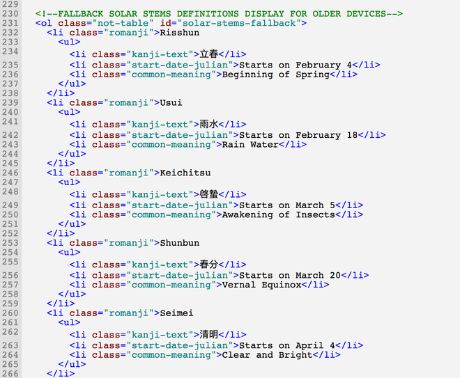
For older devices with narrower lower-resolution screens, where a tabular display will not fit, the content is coded as a nested list.
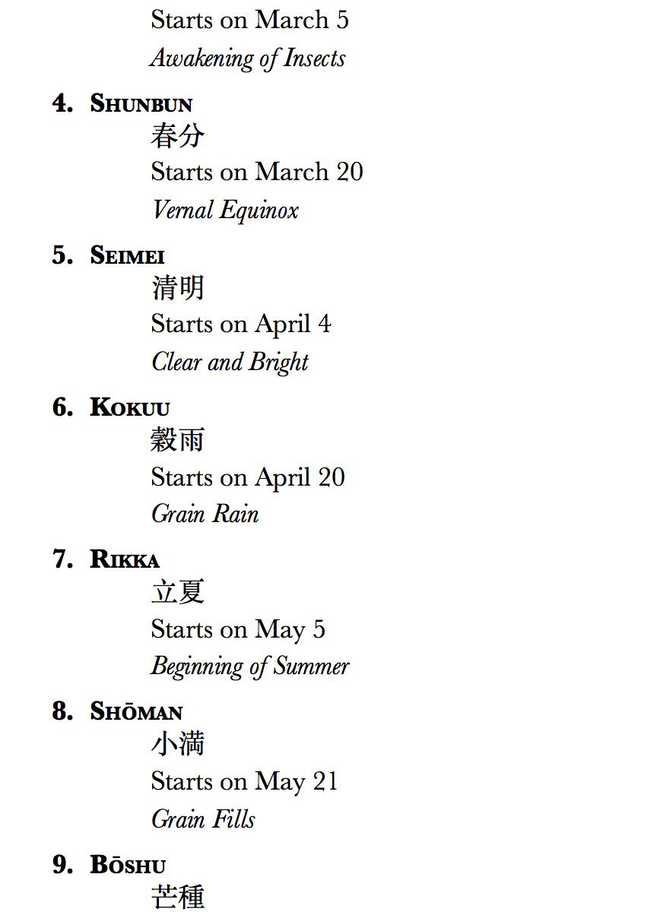
The nested list structure displays the data in a more stacked mode. Despite its different appearance, the content is coded to retain the same semantic meaning. The content is still understandable to readers — including screen reading devices.
The result is a pleasant, seamless reading experience whatever device the reader is using.
